Hi all!
Still super busy preparing items for my store grand opening on Monday! I should be around a bit more after that :) But today I am going to share my friend’s and my adventures in fabric dyeing.
 We used the advice of Jeni from In Color Order and things worked quite well. The colours we used are these four below.

 We were lucky that it was a nice day and we could dry them all outside. One thing I think we both agreed on was that it is quite a bit of work, but we also feel it is worth it.
 This was my orange batch. It ended up a bit more salmon/coral that orange but I quite like it. All of my fabrics started off as white on white tonal which is where the great patterns are coming from. This batch I messed up by putting about 6 times more of the yellow than I had intended and then the right amount of red lol.
 This one surprisingly was straight from the Royal Blue bottle. Not really royal, but I quite like the result.
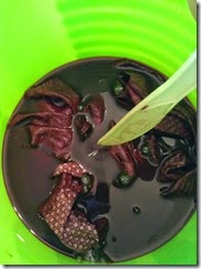
 This was my first batch and my attempt at purple. The fabric on the right was an experiment that only went in to the dye water after I was finished with it. It was nice to see it still got colour though, so one can consider that instead of making a new bath.
 For this one I had been hoping for a lime green. I think I will try and tweak this more the next time. The pale one in the middle is a tester just like above, and the dark one on the right is one I stuck in Anne-Marie’s bath for a lark. Also, can you see the one 3 from the left which is all mottled? It was the only one that had that and I have no idea why.
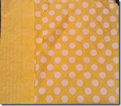
 The yellow probably ended up my favourite as it was the truest to what I was trying to achieve. This one was straight from the Lemon Yellow bottle.
We had a great time doing this and will again in the future. Luckily I have been saving all my white on whites just for this exact thing :)


Great job - the yellow turned out really well :)
ReplyDeleteVery cool, Katy! I've been saving white on white prints for a dye session like this too. They turned out great!
ReplyDeleteGreat job on these!
ReplyDeleteFantastic new logo! Your fabrics turned out well, even if they aren't exactly what you'd envisioned. I bet you'll do it again :-)
ReplyDeleteOh how fun!! I love the yellow prints a lot, as well as the oranges. :) For lime green you probably need a different green base. Dark green is pretty dark. Although perhaps if you just added less green it'd work out okay. I haven't played with Rit dyes before so I'm just guessing that's why it ended up more olive. :)
ReplyDeleteLove seeing these experiments!!
Very fun! I love how the colors just pop against the white printing.
ReplyDelete